A simple trick to make your next presentation flow
Google Suite now has over 2 billion users. Every day, 30 million PowerPoint presentations are created. But most of them aren’t so great. Here’s a simple method to improve your next deck.
One of the biggest issues with presentation decks - whether for teaching a class, pitching a client, or sharing a team update - is overcrowding. There’s just too much… stuff.
But it’s often really hard to do microscopic surgery on the whole thing and figure out what to trim. You may have tried this and ended up in a horrible mess (I know I have).
To elevate your deck quickly and easily, try using the telescope instead of the microscope. To do this, you just need one question: do the thumbnails have air?
Here’s how to figure it out:
🔳 1. Go to the Grid view (so you can see all / most of the slides in one place as thumbnails)
🔍 2. Zoom in enough so you can make out the form of the paragraph text (doesn’t matter if you can’t read it)
📚 3. View the grid as a whole and look for areas where text dominates. You’ll want to trim that text, change the design, or switch the slide ordering
🖼️ 4. Next, look for areas where there’s a lot of color. Contrast and images can be hugely effective, but rapid context switching can affect cognition and retention. ‘Pace’ these sections with some lighter design or spacer slides
👩🏽🏫 5. Anything instructional (methods, guides, frameworks etc), should fit on one slide at ideally 30pt. If it doesn’t, it’s too complicated. Simplify until it fits
🔄 6. Go back to Step 1 and repeat :)
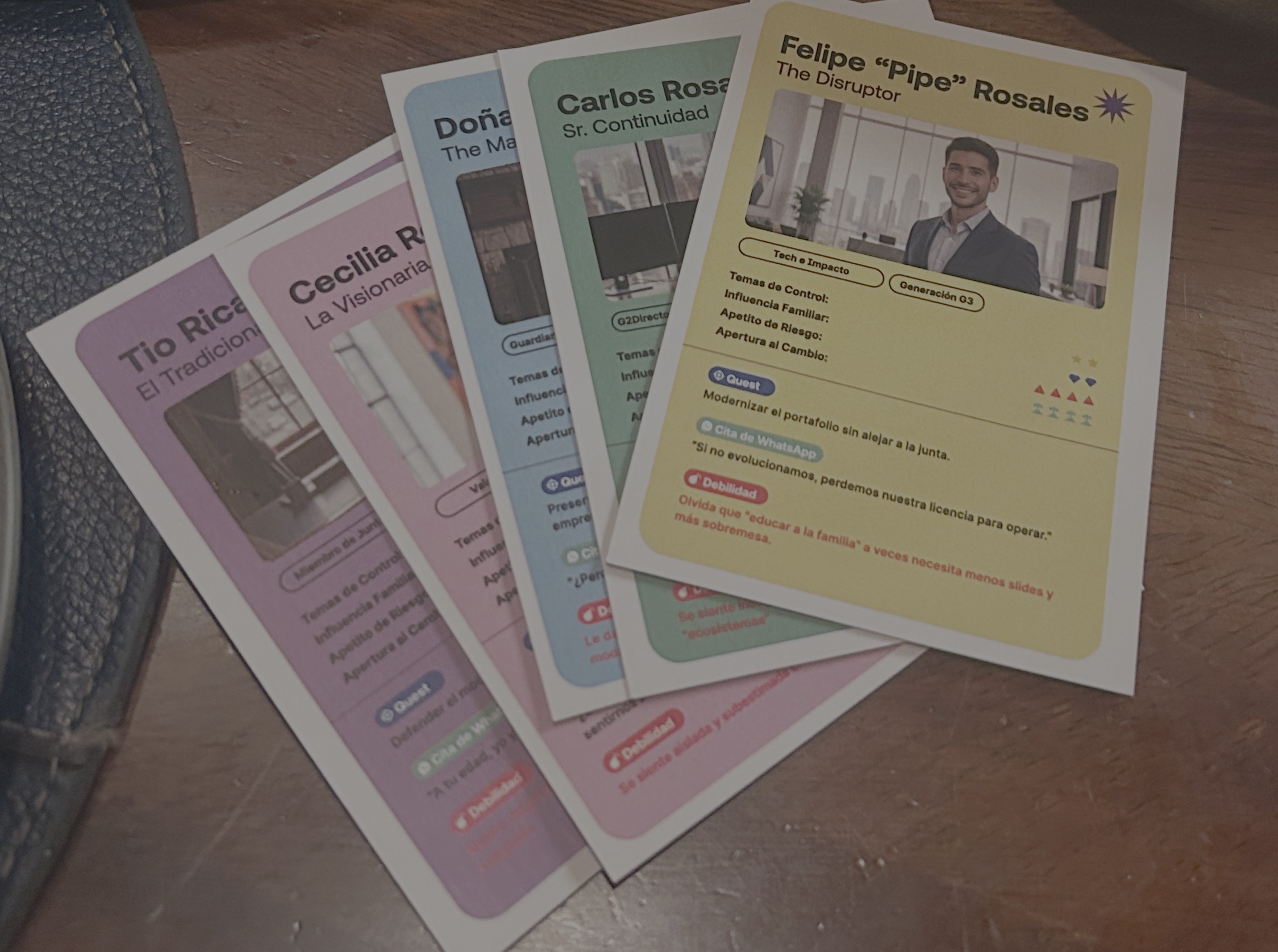
The image is the work-in-progress of the first 20 minutes of a workshop I’m running on Monday (I just added Slide 19 to space it out a bit...)
P.S. It’s often worth asking yourself if a deck is even the right format, but that’s for another post…